
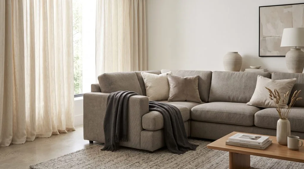
Neutral interior textiles can feel rich and inviting without bold colour, metallic finishes or elaborate decoration. The difference is usually in how the materials work together: a softly textured curtain, a well-tailored sofa, a smooth bed linen and one deeper accent.
A room becomes flat when every surface has almost the same colour, texture and visual weight. Buying more beige accessories rarely solves that problem. A small change in contrast, scale or fabric finish often makes a more noticeable difference.
This guide explains how to choose neutral curtains, upholstery and bedding that feel considered and comfortable. The palette combinations are design starting points, not fixed rules or claims about specific AMALI products.

The quick answer: vary the surface, not just the shade
For a useful starting scheme, choose a light background, a mid-tone textile and a smaller dark accent. Then give each a different surface character: perhaps an airy sheer, a matte woven upholstery and a softly lustrous cushion. Repeat one colour somewhere else to connect the room.
Luxury here means a coherent, comfortable result with thoughtful finishing. It does not require every fabric to be natural, expensive, heavy or shiny.

Start with the room’s existing neutrals
Before selecting fabric, look at the materials you are keeping: flooring, walls, stone, timber, cabinetry and the largest furniture pieces. A curtain that looks beautifully creamy in a showroom may appear distinctly yellow beside your existing cool white walls.
Neutral is a broad colour family, not one standard shade. Ivory, oatmeal, sand, greige, taupe, mushroom, warm grey, charcoal and chocolate can all play a neutral role. Their undertones and depth determine how they relate.

Warm, cool and mixed neutrals
A practical approach is to let the largest fixed surface guide the main textile family. Warm stone might suggest oatmeal and tobacco; cooler flooring might suit pearl grey, mushroom and charcoal. These are options to test, not automatic pairings.
Warm and cool neutrals can coexist. Make the connection deliberate—for example, a mixed-yarn cushion containing both the grey of the sofa and the beige of the curtains. Colour names vary between suppliers, so approve physical samples rather than relying on labels.
Create depth with light, medium and dark tones
An all-pale room can work, but it needs enough difference between surfaces for the shapes to remain visible. If your walls, sofa, curtains and rug are nearly identical, introduce a deeper throw, contrast piping or a pair of darker cushions before replacing a major item.
Keep the contrast proportionate to the mood you want. Ivory with dark chocolate feels more defined than ivory with light sand. Neither is inherently more luxurious; the question is whether the room needs sharper outlines or a softer transition.
A useful test is to stand at the doorway. Can you distinguish the seating from the floor and the curtains from the wall? If everything merges, change one layer’s depth or texture instead of adding unrelated decoration.

Choose textiles for different visual roles
You do not need every texture in one room. Select a quiet foundation and one or two contrasting surfaces. The following suggestions describe appearance; suitability and care still depend on the exact product.
| Surface | Visual contribution | What to check |
|---|---|---|
| Linen or linen-look weave | Dry, relaxed texture for curtains or suitable upholstery. | Actual composition, drape, creasing and approved application. |
| Velvet | Soft depth and changing light across a pile surface. | Pile direction, pressure marking, care and upholstery suitability. |
| Bouclé or pronounced loop texture | A tactile focal point on a chair or cushion. | Loop structure, snagging risk and maintenance needs. |
| Tonal jacquard | Pattern without a strong colour change. | Repeat, scale, orientation and appearance in folds. |
| Smooth, low-lustre fabric | A cleaner surface beside coarse or irregular textures. | Reflectivity under the room’s actual lighting. |
| Lightweight sheer | A translucent window layer that softens the visual boundary. | Transparency, drape and the need for a separate privacy layer. |
Texture names do not establish fibre content
A linen-look fabric is not necessarily linen, and velvet is not necessarily silk. Jacquard describes a method of creating woven designs rather than a single fibre. Ask for the composition and intended use before deciding how a textile will perform.

Use sheen selectively
A restrained change in reflectivity can give a neutral scheme dimension. Try a matte sofa with a subtle lustre on a cushion, or textured curtains beside smooth bedding. The contrast is easier to appreciate when not every surface reflects light in the same way.
Look at lustrous and piled samples from several angles. What appears quiet on a flat swatch may become much more noticeable over a curved arm, deep curtain fold or large bedspread. Move the sample before approving it.

Let curtains establish the room’s scale
Curtains occupy a large vertical area, so their length, fullness, heading and movement can have as much visual influence as their colour. A pleasing neutral fabric still needs a correctly measured and appropriate installation.
Choose the relationship to the wall
Curtains close to the wall colour can create continuity. A slightly deeper tone frames the window more clearly. If the room already contains a strong sofa texture, a quieter curtain weave can keep the scheme balanced.
Evaluate a hanging sample rather than only a small flat swatch. Folds create highlights and shadows, while daylight through the material can change how the colour reads. Include the proposed lining when assessing the final appearance.
Separate appearance from light control
A sheer layer may suit the visual scheme, but it should not be assumed to provide nighttime privacy. Bedrooms may need an independently closing opaque or blackout layer. Blackout performance and edge light leakage depend on the selected material and installation, not the neutral colour.
When comparing curtain options, decide on the required light control and heading before finalising the decorative surface. In bright UAE rooms, review the window orientation and real exposure rather than treating all rooms alike.

Make neutral upholstery work for everyday living
An ivory sofa is a design choice, not a requirement for a luxurious interior. A mid-tone oatmeal, mushroom or softly mixed neutral may be a better visual and practical fit for a frequently used family room.
A subtly varied weave can make minor visual marks less obvious than a uniform pale surface, but it does not prevent stains or replace cleaning. Dark fabrics can also show lint and pale pet hair. Compare the sample with the types of soiling likely in your home.
Check the current upholstery specification for relevant abrasion, pilling, colourfastness, seam performance and care information. A soft handle, natural-fibre label or high price does not establish durability. For pets, inspect the surface for loops or yarns that may catch.
If you like a highly textured fabric but are unsure about maintaining it across a large sofa, consider using it on a smaller accent piece while keeping the main seating in a more manageable construction.

Build a layered neutral bed without overfilling it
Start with comfortable, correctly sized bed linen. Add a coverlet or duvet cover with a different surface, then a modest accent at the foot of the bed. A smooth sheet, lightly textured cover and deeper throw can provide enough variety without a large pile of decorative cushions.
Keep the sleeping layer distinct from the decorative layer. Choose sheets and covers by their verified composition, weave, care instructions and personal comfort—not because they match the curtain fabric.
For a simple combination, try warm white sheets, a sand-coloured coverlet and a taupe accent. Confirm the actual fibre composition separately from the styling description. Review bedding sizes and options before choosing the final colour combination.

Three neutral palette starting points
These are original styling suggestions to test against your room, not pre-matched product sets. Keep the quantity of each colour flexible.
| Mood | Main textile | Supporting layer | Small accent |
|---|---|---|---|
| Warm and relaxed | Oatmeal matte upholstery | Ivory sheer with sand-coloured curtains | Tobacco-toned textured cushion |
| Quiet and tailored | Mushroom woven upholstery | Pearl-grey curtains with a soft drape | Charcoal piping or cushion |
| Soft and formal | Taupe upholstery with a subtle texture | Warm ivory curtains | Low-lustre tonal jacquard |
For a majlis, the soft and formal direction can work with a repeated tonal motif and carefully aligned cushions. For a bedroom, the warm scheme can be quieter if the deepest accent is kept small. In either case, adjust the palette to the architecture rather than copying it literally.

Test the samples where they will be used
Place shortlisted textiles beside the actual floor, wall finish and furniture. View curtains vertically near the window, upholstery across a seat or back, and bedding horizontally on the bed. Keep the intended face and pile direction consistent.
Check the combination in daylight and under the lamps you normally use at night. Photographs are useful records, but a phone’s exposure, processing and screen settings can change the apparent colour. Make the final decision from the physical materials.
For a bright apartment, examine how the curtain looks with light behind it. For a room used mainly in the evening, give the evening check equal importance. Avoid approving a whole-room scheme from one tiny swatch viewed in isolation.

Where to focus the budget
Start with the largest item that is visibly underperforming: curtains with insufficient coverage, uncomfortable bedding or upholstery unsuitable for the room’s use. A new cushion arrangement cannot fix poor fit or an impractical main fabric.
If the foundations already work, refresh only the layer that is missing. This could be a darker cushion, a textured coverlet or a quieter curtain surface. Keep good existing pieces and use samples to confirm that the addition solves a specific problem.
When reviewing furnishing fabrics, compare suitability and making requirements as well as the price per metre. Pattern matching, pile direction and installation details can affect the finished project and should be discussed before purchase.

Common mistakes that make neutrals feel flat
- Choosing every item in almost the same shade and finish.
- Mixing creamy and cool whites without checking them together.
- Using shine on every major surface.
- Adding many small accessories instead of improving the main textile proportions.
- Assuming pale, natural or expensive automatically means luxurious.
- Ignoring privacy, cleanability or comfort to preserve a colour scheme.
- Approving colours from photographs alone.
- Buying coordinated fabrics without checking that each suits its intended use.

A final selection checklist
- Identify the existing finish that will guide the main neutral family.
- Choose a light, medium and deeper tone if the room needs definition.
- Give the main textiles different surface roles.
- Check curtain fit, heading and privacy requirements.
- Confirm upholstery and bedding specifications and care.
- Compare physical samples in their intended orientation, by day and at night.
- Remove any layer that adds clutter without useful contrast.

Frequently asked questions
How do I make a beige room feel more luxurious?
Improve the contrast between surfaces before adding more objects. Pair a matte or textured foundation with a smoother layer, introduce one deeper neutral and check curtain proportions. A coherent palette and good finishing matter more than adding gold or shine.
Can I mix beige and grey textiles?
Yes. Compare their undertones against the room’s fixed finishes and use a connecting material if needed. A mixed-yarn fabric containing both colours can help the combination feel intentional. Test the actual samples together.
Do neutral curtains need to match the sofa?
No. They can relate through undertone or colour depth while using a different texture. Exact matching is optional; the goal is a clear relationship across the room, not identical fabric on every surface.
Is linen always the best choice for a neutral interior?
No single fibre is always best. Linen can provide a particular texture, but linen-look blends and other constructions may suit different care, drape or upholstery requirements. Check the composition and specification rather than deciding from the appearance alone.
How many textures should I combine?
Start with a small number of clearly different surfaces and judge the result at room scale. An airy window layer, a matte main textile and one tactile accent may be enough. Add another only if it serves a clear purpose.
Can a neutral interior work with children or pets?
Yes, but choose the main textiles for actual use. Consider surface construction, likely marks, snagging and the approved cleaning method. Neutral colours are neither inherently easy-care nor stain-resistant.
The final decision
Neutral textiles feel luxurious when the colours relate, the surfaces have purposeful contrast and the finished pieces work comfortably in the room. Begin with the practical requirements, then build texture and depth around them.
You do not need a completely new scheme. Often, a well-chosen layer and better proportions are enough to turn a collection of neutral pieces into a coherent interior.
