
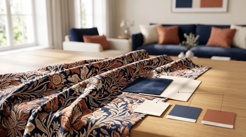
When decorating a new room, the instinct for most homeowners is to head straight to the hardware store, select a paint colour, and roll it onto the walls. In professional interior design, this is often considered a critical misstep. Why? Because paint can be custom-tinted to match an infinite spectrum of shades. High-quality textiles, on the other hand, are meticulously curated and far more limited.
Welcome to textile-led design. By selecting your primary fabric first—whether it is a striking jacquard curtain, a velvet sofa, or a patterned rug—you create a flawless, built-in roadmap for the rest of the room’s colour palette.
Quick Takeaways: The Textile-First Rule
- Pick Fabric Before Paint: It is infinitely easier to match a paint chip to a curtain fabric than to find a curtain fabric that perfectly matches a pre-painted wall.
- Find Your “Hero”: Start the room’s design with one statement textile that contains at least three distinct colours.
- Use the 60-30-10 Rule: Extract the background colour of your fabric for the walls (60%), the secondary colour for the upholstery (30%), and the boldest colour for accents (10%).
Step 1: Choose Your “Hero” Fabric
Every well-designed room needs a starting point. Your “hero” fabric is the focal point textile that will anchor the space. It should be a pattern, weave, or colour combination that you absolutely love.
Common hero textiles include:
- A patterned or richly textured main curtain in the living room.
- A statement upholstered headboard or luxury duvet cover in a bedroom.
- A large-scale Persian or contemporary rug.
- A vibrant, multi-coloured accent chair or sofa.
Step 2: Deconstruct the Colour DNA
Once you have your hero fabric, lay it flat in the natural light of the room you are designing. A good patterned fabric naturally contains a perfectly balanced colour palette designed by a textile artist. Your job is simply to extract those colours and apply them to the room using the classic 60-30-10 design rule.
- The 60% (The Background): Look at the dominant background or neutral colour of your hero fabric. This is usually an ivory, warm beige, soft grey, or muted navy. This colour becomes your dominant room colour, applied to walls, large area rugs, or the ceiling.
- The 30% (The Secondary Colour): Identify the secondary colour in the fabric’s pattern. This should be used for large furniture pieces, such as your primary sofa, secondary curtains, or a large duvet.
- The 10% (The Accent Colour): Find the brightest, boldest, or darkest thread in the fabric. This is your accent. Use this colour sparingly for throw cushions, lampshades, artwork, or a small ottoman.
Design Pro Tip: Match Undertones, Not Just Colours
If your hero curtain fabric has a warm, yellow-based cream background, do not pair it with a cool, blue-based white paint. Mismatched undertones will make the fabric look “dirty” or the walls look stark and clinical. Always match warm with warm, and cool with cool.
Step 3: Layering Solids and Textures
If your hero fabric is heavily patterned, the rest of the room’s textiles should act in a supporting role to prevent visual clutter. This is where you introduce solid, textured fabrics that pull from your 30% and 10% colour buckets.
To keep solid colours from looking flat, vary the textile weights and finishes. For example, if your hero fabric is a smooth, printed linen curtain, pair it with a chunky bouclé sofa, matte velvet accent cushions, and an airy sheer chiffon inner curtain. The colours will match, but the contrasting textures will create depth and luxury.
Step 4: Selecting the Paint (Finally!)
Only after you have selected your curtains, upholstery, and rugs should you open a paint deck. Take a physical swatch of your hero fabric to the paint store.
For a seamless, high-end look, ask the paint specialist to colour-match the background hue of your fabric exactly. Alternatively, if you want your curtains or headboard to stand out boldly, choose a paint colour that contrasts with the fabric on the colour wheel (such as a soft terracotta wall behind a deep navy curtain).
Lighting Note for UAE Interiors
Strong desert sunlight will wash out pale fabrics and drastically alter how paint colours read on a wall. Always test your fabric swatches and paint samples together in the actual room, checking them at 10:00 AM in full sun, and at 8:00 PM under artificial LED lighting.
The Result: A Masterfully Cohesive Space
By shifting your process to a textile-led approach, you eliminate the guesswork of interior styling. Your room will no longer feel like a collection of separate items, but rather a deliberate, unified design where the curtains, cushions, walls, and furniture are in constant, harmonious dialogue.
Find Your Hero Fabric
Ready to start your room’s design journey? Explore AMALI’s curated premium fabric collections for curtains and upholstery, or contact our design specialists to request samples and begin building your perfect palette.