
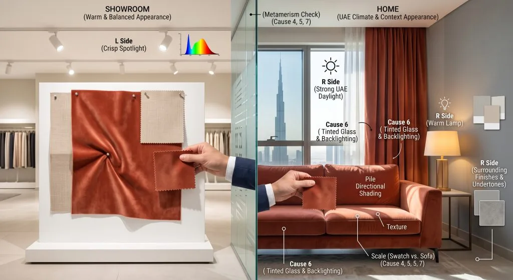
A fabric can look perfectly warm, balanced and coordinated in a showroom, then appear cooler, darker or more saturated when it reaches your home. This does not automatically mean that the wrong colour was supplied. Fabric colour is an appearance produced by the material, the light falling on it and the setting in which you view it.
Showrooms and homes rarely have identical daylight, lamps, wall colours, flooring or viewing distances. A small flat swatch can also behave differently from a full curtain hanging in deep folds or a large upholstered sofa.
The safest approach is to use the showroom for comparison, then approve the largest available sample in the actual room. This guide explains what changes the appearance of fabric colour, what is normal, and how to make a more reliable selection before ordering.

The quick answer: why does the same fabric look different?
Several factors may be acting together:
- Light source: daylight, warm lamps and cool lamps do not contain the same balance of wavelengths.
- Time and direction: morning light, afternoon sun and shaded daylight can make one colour feel different.
- Surroundings: walls, floors, furniture and nearby colours affect comparison and may reflect colour onto the fabric.
- Material surface: texture, sheen, weave, pile and viewing angle change how light is reflected.
- Scale and construction: a small swatch is flat, while finished curtains form highlights and shadows in their folds.
- Glazing and layers: tinted glass, solar films, sheers, blinds and linings can alter the light reaching or passing through a fabric.
- Production batch: a separate sample and the supplied fabric may occasionally come from different dye lots.
| Possible cause | What you may notice | How to check it |
|---|---|---|
| Different lighting | The colour looks warmer, cooler, duller or brighter | View it under daylight and the room’s normal lamps |
| Texture or pile | Light and dark areas appear as the angle changes | Rotate or stroke the sample and view it vertically |
| Small sample | The installed fabric feels stronger or darker | Request a larger hanging sample where available |
| Surrounding finishes | The undertone seems to change beside a wall or sofa | Compare it directly with the fixed finishes in the room |
| Backlighting | A curtain appears paler or more luminous during the day | Test against the actual window and with the curtain closed |
| Different batch | Two physical pieces remain slightly different under the same conditions | Compare batch references and retained approval samples |

Lighting is usually the biggest reason
We see a fabric because light reaches its surface and part of that light is reflected to our eyes. Change the light, and the reflected colour can change in appearance even though the fabric itself has not physically changed.
Showroom lighting and home lighting are not equivalent
A showroom may use bright, evenly distributed lighting designed to make materials easy to inspect. At home, the same fabric may sit beside a window, in a shaded corner or under a mixture of ceiling lights, wall lights and decorative lamps. The difference in intensity and spectral composition can reveal an undertone that was less obvious in the showroom.
Warm-white lamps commonly make creams, beiges, terracottas and warm woods feel richer, while cooler-looking illumination may make grey, blue or green undertones more apparent. These are useful tendencies, not fixed rules: the result depends on the particular lamp and the particular fabric.
Colour temperature is only part of the story
Correlated colour temperature, normally shown in kelvins, describes whether a white light generally appears warmer or cooler. It does not fully describe how accurately or attractively that light will render every textile colour. Two lamps labelled with the same colour temperature can have different spectral output, so a fabric may not look identical beneath both.
For a real purchase decision, the best test is therefore not the kelvin number alone. Place the sample under the exact lamps you normally use in that room.
Daylight changes through the day
Daylight is not constant. A room can receive soft indirect light in the morning, stronger direct sun later and artificial light after sunset. Window direction, balcony depth, nearby buildings and external shading all influence the result. In the UAE, intense daylight can make pale materials appear very bright near a window while deeper folds and shaded areas remain noticeably darker.
Judge the sample at the times when the room is used most. A bedroom colour should work in early daylight and evening lamp light; a living room used throughout the day should be checked in several conditions. Our guide to choosing fabrics for the UAE climate explains how sunlight and room use also affect broader textile decisions.

What is metamerism?
Metamerism describes a specific situation in which two materials appear to match under one light source but no longer match under another. For example, a curtain and sofa fabric may coordinate beneath showroom lighting, yet their undertones may separate in daylight because the two materials reflect wavelengths differently.
This is different from one fabric simply appearing warmer or cooler as the light changes. Colour specialists call that behaviour colour inconstancy. The practical lesson is the same: never approve an important colour relationship under only one light source.
When matching different materials—such as paint, timber, leather and textile—test the physical samples together in daylight and under the room’s evening lighting. A digital colour reference cannot reveal whether the physical materials will remain coordinated under both.

Walls, floors and furniture influence what you see
Colour is judged in context. A neutral fabric placed beside a cool grey wall can feel warmer than the same fabric beside cream paint. A red rug, warm timber floor or strongly coloured sofa can also reflect some of its light onto nearby surfaces, especially in a bright room.
This is why viewing a swatch against a white showroom display is not enough. Hold it beside the actual wall, floor, headboard, sofa or joinery it needs to coordinate with. If those finishes have not been installed, compare current physical samples from the project rather than relying on names such as “ivory”, “sand” or “greige”. Colour names are descriptive, not universal standards.
The background behind the fabric matters too
Some fabrics are partially translucent. A sheer viewed against a bright window may look lighter and less saturated than the same sheer folded on a table. An open-weave upholstery sample can also be influenced by the foam, lining or surface beneath it.
Test translucent and open constructions with their intended backing. For curtains, compare the face fabric both with and without the proposed lining because the backing can change depth, opacity and perceived colour.

Texture, sheen and pile can change colour appearance
A colour is not separate from the surface carrying it. Matt, glossy, brushed, embossed and heavily textured fabrics control light differently. The same nominal shade can therefore feel flatter on a plain weave and more changeable on velvet or satin.
Sheen creates highlights and shadows
Smooth yarns and lustrous weaves can create bright highlights when light strikes them directly. From another angle, the same area may look deeper or less saturated. A large installation makes this effect more visible because different folds and panels face the light at different angles.
Pile fabrics are directional
Velvet, chenille and other raised or brushed surfaces may appear lighter or darker depending on the direction of the pile and the viewer. If one cut piece is turned, it can look like a different shade beside the others even when all pieces came from the same roll.
Before approval, confirm the sample’s intended top and direction. During fabrication, directional materials should be cut consistently unless the specification deliberately requires another arrangement.

Why a small swatch may not predict a full installation
A small sample is useful for narrowing choices, feeling the texture and checking basic coordination. It cannot fully show how several square metres of colour will affect a room.
Large areas often feel more visually dominant than small swatches. Curtains also include folds, overlaps, returns and hems, producing alternating bands of light and shadow. Upholstery stretches fabric across broad planes, curved arms, cushions and piping. Pattern scale and repeat may become prominent only when more fabric is visible.
Where the decision is important or the quantity is substantial, request the largest practical sample, a hanging length or a finished mock-up. Stand back to the normal viewing distance rather than judging only from a few centimetres away.

Glass, films and window treatments can alter the result
Tinted glazing, reflective coatings and solar-control films can change the amount and character of daylight entering a room. External shading, a balcony or another building may have an equally strong effect. Inside, a sheer, roller blind or second curtain layer can filter the light before it reaches the face fabric or surrounding furnishings.
Do not assess a curtain sample at a different window and assume it will behave identically. Pin it vertically at the intended window, with the actual glazing and other window layers in place where possible. Check it while front-lit from the room and backlit by daylight.

Why photographs and screens are unreliable for final approval
Product photographs are valuable for discovering colours and comparing designs, but a screen cannot reproduce every physical textile exactly. Camera exposure, white balance, editing, display calibration, brightness settings and surrounding screen light can all influence the image.
Two phones may show the same photograph differently. A phone camera may also automatically neutralise the warm lighting that your eyes experience in the room. Use photographs to record combinations and communicate a direction, but use a current physical sample for final colour approval whenever colour accuracy matters.

Is it lighting, direction or a different fabric batch?
It is important not to call every apparent difference a dye-lot problem. First compare the two pieces side by side, facing the same direction, under the same light and against the same background.
- If one piece changes when it is rotated, direction, pile or surface reflection is a likely contributor.
- If both pieces match under one lamp but separate under daylight, metamerism may be involved.
- If the same single piece merely looks different between the showroom and home, the viewing environment is likely responsible.
- If two correctly aligned pieces remain different under the same controlled conditions, check their roll or batch references.
Textile production can permit slight variation between batches, so a showroom cutting retained from an earlier production run may not be identical to current stock. For a multi-piece installation, confirm that the required quantity is available from one batch and approve a sample representing the material intended for supply.

How to test a fabric colour at home
Use this process before approving curtains, upholstery or another colour-sensitive textile:
- Obtain a current physical sample. Ask whether it represents the stock or batch intended for your order.
- Request a useful size. Choose the largest available sample, especially for textured, patterned or lustrous fabric.
- Confirm direction. Mark the top and pile direction so you do not compare the fabric upside down.
- Place it where it will be used. Hang curtain fabric vertically at the window; place upholstery fabric on the actual sofa or beside its fixed finishes.
- Use the intended backing. Add the specified lining, foam or substrate if it may influence the appearance.
- Check several times. Review it in morning daylight, later daylight and after sunset under the room’s normal lamps.
- Compare the real neighbours. Put paint, flooring, timber, stone and coordinating textile samples beside it.
- Change your position. View from the normal seating or entrance point and from the side to reveal sheen or pile effects.
- Record the approval. Label the chosen code, colour, direction, date and batch reference, then retain the approved piece where practical.
Example approval note: Fabric code AL-000; colour Sand; viewed vertically with approved lining; checked in daylight and 3000 K room lighting; top direction marked; current batch reference confirmed.

Testing curtains, upholstery and project textiles
| Application | Best sample position | Important conditions to check |
|---|---|---|
| Bedroom curtains | Vertical at the intended window | Morning daylight, closed-curtain appearance, lining and evening lamps |
| Living-room curtains | Vertical beside wall and flooring | Direct or reflected sun, daytime backlighting and night lighting |
| Sofa upholstery | Across the seat or back at the intended angle | Pile direction, room lamps, rug, timber and neighbouring cushions |
| Headboard or bed base | Vertical beside wall paint and bedding | Bedside lamps, shadow behind the bed and large-area effect |
| Hospitality project | Full-size mock-up in a representative room | Specified lamps, glazing, all adjacent finishes and approved production batch |
For residential selection, browse the AMALI fabric collection to identify suitable options, then compare physical samples in their intended setting. For repeated rooms or a commercial project, one representative room or full-size mock-up can expose colour interactions before wider production.

Common colour-selection mistakes
- Approving a colour only beneath showroom spotlights.
- Judging from a website photograph or messaging-app image alone.
- Testing a curtain fabric flat on a table instead of vertically at the window.
- Ignoring the proposed lining or the upholstery substrate.
- Comparing samples under different lights or against different backgrounds.
- Turning a velvet or directional fabric and interpreting the result as shade variation.
- Expecting a tiny swatch to show the visual weight of a full wall of curtains.
- Choosing by colour name rather than physical appearance.
- Failing to confirm whether current stock matches an older showroom sample.
- Approving one coordinating pair only under a single light source.

Final fabric colour approval checklist
- Current physical sample obtained
- Fabric code and colour reference recorded
- Top, pattern or pile direction marked
- Sample tested in its intended orientation
- Actual lining or backing considered
- Morning, afternoon and evening conditions checked as relevant
- Room’s normal artificial lights switched on for testing
- Wall, floor, timber and furniture finishes compared
- Normal viewing distance and side angles assessed
- Required quantity and one-batch availability confirmed where important
- Approved sample labelled and retained where practical

Frequently asked questions
Why does beige fabric look grey in my home?
The room may have cooler daylight or artificial lighting than the showroom, or nearby grey, blue or white finishes may make the cooler undertone more noticeable. Test the sample beside the actual wall and flooring in daylight and at night.
Can warm and cool LED lights change fabric colour?
Yes. Different lamps can alter the perceived warmth, saturation and undertones of a textile. Colour temperature is useful information, but lamps with similar labels can still render materials differently. Always check the fabric under the installed light source.
Why do my curtains look lighter during the day?
Daylight behind the curtain can pass through or illuminate its weave, making the material look brighter or less saturated. The effect depends on opacity, weave, colour, lining, folds and the strength of daylight.
Why does velvet look like two different shades?
Velvet has a directional pile. When the pile faces a different way, it reflects light differently and may appear lighter or darker. Compare pieces with their top and pile direction aligned before deciding that the shade differs.
Is a showroom sample guaranteed to look identical at home?
No physical colour can be guaranteed to appear identical under different lighting and surroundings. A showroom sample is a selection aid; home testing is the more reliable way to judge appearance in the intended setting.
How large should a fabric sample be?
Use the largest practical sample available. Small cuttings help shortlist options, but a larger piece better reveals pattern, texture, sheen, direction and the effect of folds. Major or repeated projects may justify a full-size mock-up.
Should I match fabric to paint using a photograph?
A photograph can help communicate the general direction, but it is not reliable for final matching. Compare the physical fabric and paint sample together under the lighting that will be used in the completed room.
Does a different appearance always mean a different dye lot?
No. Lighting, background, orientation, pile and backlighting should be checked first. If two correctly aligned physical pieces still differ when viewed together under the same conditions, confirm their batch or roll references with the supplier.

Choose colour in the room where it will live
A showroom is an excellent place to discover fabrics, compare constructions and create a shortlist. Your home is where the final colour decision should be tested. Viewing a current, correctly oriented sample beside the real finishes—during the day and under the room’s normal lamps—reduces surprises far more effectively than relying on a colour name or screen image.

If an installed fabric seems different, compare it systematically before assuming there is a fault: keep the light, background and direction consistent, then check the production references. That distinction helps separate a normal change in colour appearance from a genuine material or batch concern.